
Prepit Pro – E-Learning Platform UI/UX Design
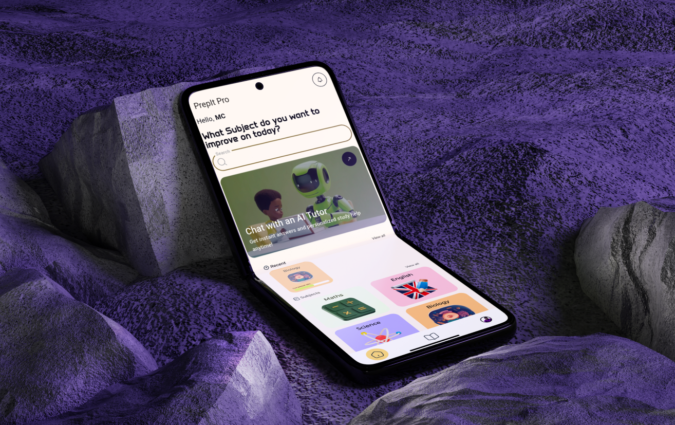
Prepit Pro is a modern e-learning platform designed to help students prepare for exams through structured study materials, past questions, and AI-powered assistance. This project focused on designing an intuitive and engaging user interface for both mobile and web platforms, ensuring a seamless and accessible learning experience.
Client
Self-Initiated Project
Start
July 2024
Complete
September 2024
Services
UI/UX Design (Mobile & Web)
Website
prepitpro.com
Description
Prepit Pro was designed to address gaps in traditional learning systems by providing students with a centralized, digital platform for exam preparation. The UI design process focused on creating a clean, structured, and engaging interface that simplifies access to study materials, practice questions, and AI-powered learning support. Special attention was given to usability, ensuring that students across different education levels can easily navigate the platform without confusion. The design system ensures consistency across both mobile and web experiences, allowing users to transition seamlessly between devices.
Key Features
-
Student-Centered Interface: Designed with simplicity and clarity to help students focus on learning without distractions.
-
Structured Learning Flow: Organized navigation for subjects, topics, and exam categories (e.g., WAEC, JAMB).
-
Past Questions & Practice Modules: Interfaces designed for easy access to exam questions with clear answer feedback layouts.
-
AI-Powered Assistance UI: Integrated design for asking questions and receiving intelligent explanations.
-
Cross-Platform Consistency: Unified design system ensuring a consistent experience across mobile and web.
-
Progress & Performance Tracking: Visual components designed to help students monitor their learning progress.
Technologies Used
-
Design Tool: Figma
-
Prototyping: Interactive prototypes for user flow demonstration
-
Design System: Typography, color system, and reusable components
Design Highlights
-
Clean and Focused Learning Experience: Minimal distractions with a strong emphasis on readability and usability.
-
Scalable Design System: Built reusable components to support future expansion of features.
-
Mobile-First Approach: Prioritized mobile usability while maintaining a responsive web experience.
-
Modern EdTech Aesthetic: Balanced use of color, spacing, and typography to create an engaging interface.
Year of
Experience
Projects
Completed
Satisfied
Happy Clients
Awards
Won Received
Get in touch
I'm always excited to take on new projects and collaborate with innovative minds. If youhave a project in mind or just want to chat about design, feel free to reach out!